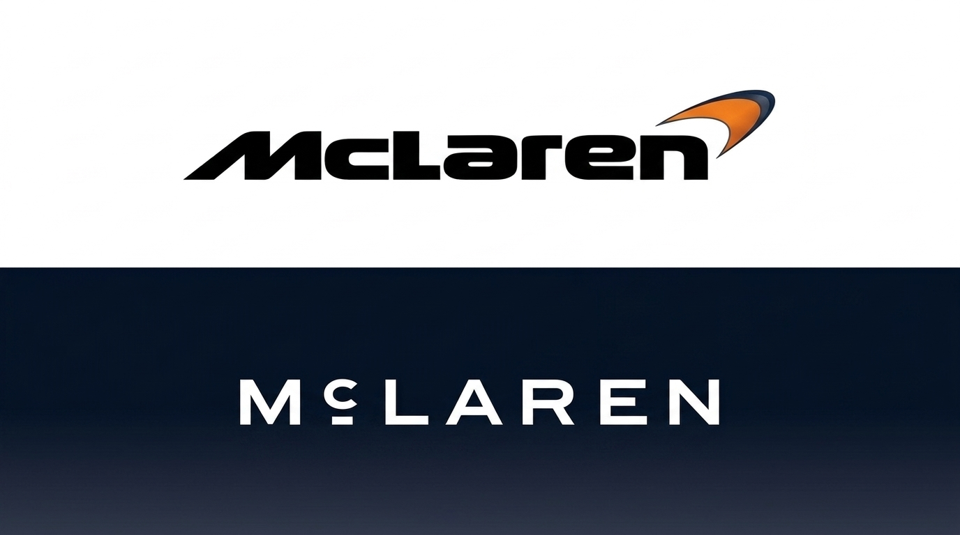
McLaren has officially opened a new chapter in its history by introducing an evolved brand identity, including an updated McLaren wordmark that has long been one of the most recognizable identities in the automotive world and Formula 1.
Launched on September 22, 2026, the new identity is designed to unite McLaren Racing and McLaren Automotive under a more consistent visual language. However, rather than abandoning its history, McLaren has chosen to revisit the company’s roots, which trace back to Bruce McLaren.
More Than Just a Logo Change
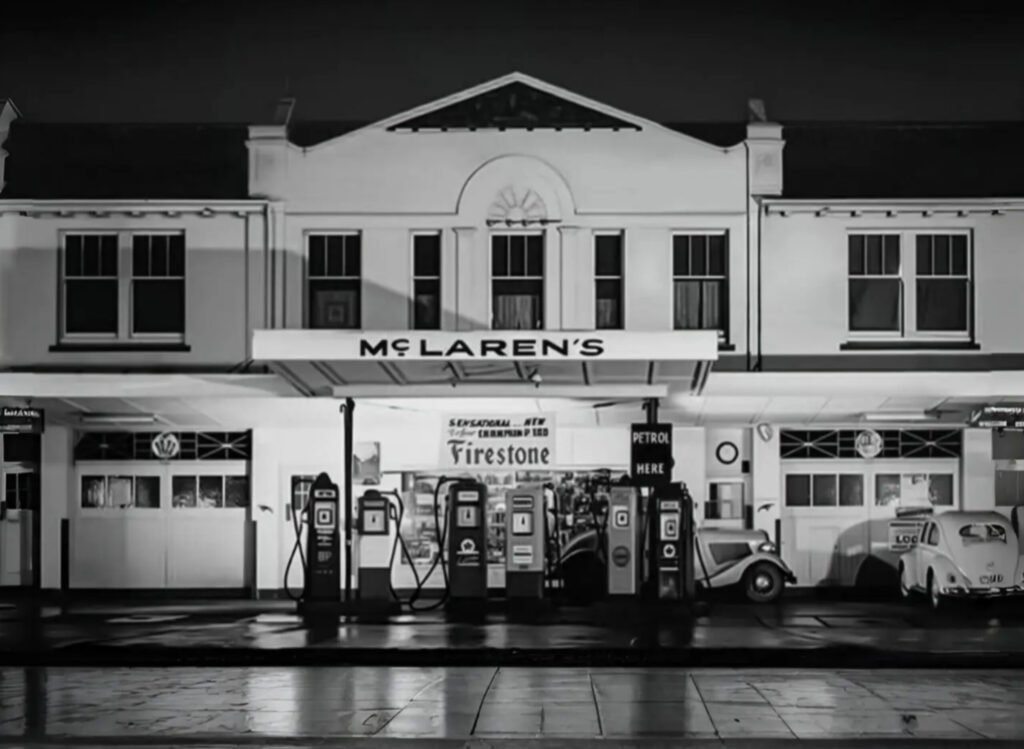
The most visible change can be seen in the McLaren wordmark. The new design draws inspiration from the sign that once stood above the McLaren family workshop in Remuera, Auckland, New Zealand.
The location holds special significance in McLaren’s history. It was there that Bruce McLaren developed his interest in mechanics and built the car that would later bring him his first racing victory.
As a result, the new logo is not simply an attempt to make McLaren look more modern. The company wants to bring back visual elements from the period when Bruce McLaren himself was still laying the foundation for what would become one of the biggest names in motorsport.
The Speedmark Remains
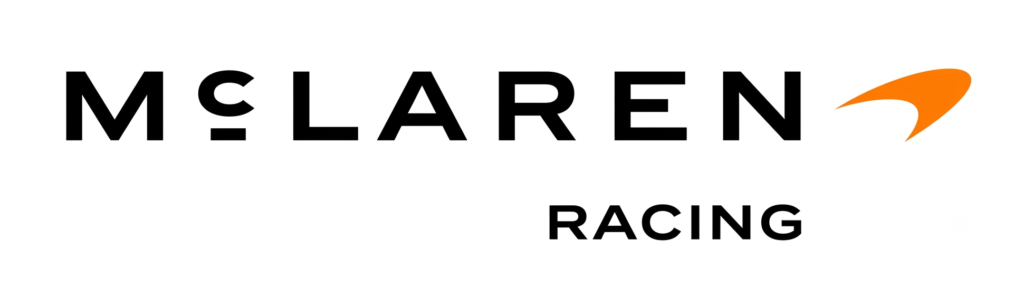
Although the identity has been updated, McLaren has not discarded all of its existing visual elements.
The Speedmark, the distinctive chevron-shaped symbol that has become an important part of McLaren’s identity, has been retained. So has the Speedy Kiwi, a symbol directly connected to Bruce McLaren’s New Zealand roots.
The color Papaya also remains a central element.
Over the years, Papaya has become one of the colors most closely associated with McLaren, particularly following the Formula 1 team’s resurgence in the modern era. Under the new identity, Papaya is joined by a broader color palette, including Ember and Midnight, inspired by various important periods in McLaren’s history.
McLaren Sans Is Born
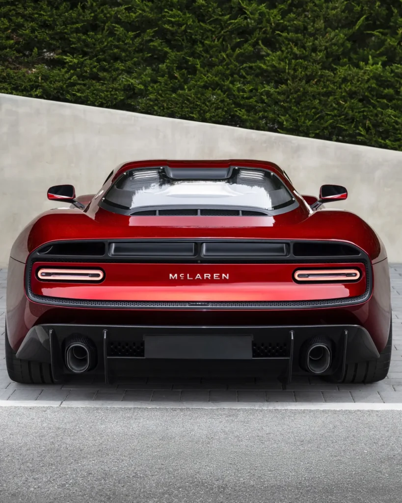
The refresh does not stop at the logo.
McLaren has developed a custom typeface called McLaren Sans to support the new wordmark and visual identity system. The goal is to create a design language that can be used consistently across different parts of McLaren’s business.
This means the change will be felt far beyond a logo placed on a Formula 1 car. The new identity is designed for use across Racing, Automotive, products, customer experiences, merchandise, and digital communications.
From Bruce McLaren to a New Era
McLaren says the new identity is intended to connect more than six decades of history with the company’s future direction.
The move comes as McLaren enters a major phase of expansion. In September 2026, McLaren Automotive also announced a £500 million investment to expand its manufacturing and engineering facilities in the UK, including the development of new models and McLaren’s first SUV.
In other words, the logo change arrives at a crucial moment. McLaren is no longer simply a racing team or a small-scale supercar manufacturer. The company is attempting to build a much larger McLaren ecosystem.
That is where the new logo becomes important.
McLaren wants to look modern without losing the DNA that made its name famous since the days of Bruce McLaren.
As McLaren Racing Chief Marketing Officer Lou McEwen said, the new identity is intended to bridge the heritage of the past with the ambitions of the future, while preserving the symbols and stories already familiar to fans.
What makes McLaren’s move interesting is that the company has not pursued a brutal design revolution. Instead, it has taken a more historically bold approach: digging into the past to create a future identity.
The logo may appear to be a small change, but when a brand like McLaren updates its identity after more than six decades, even the smallest details can carry significant meaning. The change also comes alongside McLaren Automotive’s major expansion and plans to enter a new segment.
The question now is: does McLaren’s new logo feel stronger, or was the old logo more iconic?
What do you think? Share your opinion in the comments.

Adhe is part of the 88 Eight Box Editorial Team, covering JDM culture, motorsport, automotive technology, and industry news. The team focuses on delivering original automotive stories, reviews, and insights for enthusiasts worldwide.